
Change the Salt Lake City Flag
If you have read our previous posts, then you already know that we are nerds. So it will come as no surprise to you that Jorrien is a dues paying member of the North American Vexillological Association, an organization dedicated to the study of flags. We love flags, and more importantly, we love well designed flags. “Sometimes I bring up the topic of flags, and people are like, ‘Flags? I don’t care about flags.’ And then we start talking about flags, and trust me, 100% of people care about flags. There’s just something about them that works on our emotions.” (Roman Mars).
We are proud to call Salt Lake City home, but we are not proud to call the official flag of Salt Lake City ours. Did you even realize that Salt Lake City has a flag? Most people we’ve talked to had no idea. Unfortunately, the Salt Lake City flag is sorely lacking. There are five rules to good flag design, and Salt Lake’s flag pretty much breaks them all. It’s complicated, it’s busy, and it’s not attractive. “A great city flag is something that represents a city to its people, and its people to the world at large. And when that flag is a beautiful thing, that connection is a beautiful thing.” (Roman Mars).
The current Salt Lake City flag (pictured above) was approved in 2006. Mayor Rocky Anderson sponsored a contest to redesign the flag, which received more than fifty entries. The city council was unimpressed with the options, and formed a subcommittee with the mayor’s office to design a new flag. The results were less than desirable. Salt Lake City needs a new flag to rally under, and we need your help to make that happen! “I like to say that in every bad flag, there is a good flag trying to get out.” (Ted Kaye).
Let’s stop right here. Be honest, if you don’t feel like reading on, that’s fine, but do us a favor and watch this short TED talk by Roman Mars. Trust us. Watch this and you’ll understand.
Why city flags may be the worst-designed thing you've never noticed
Why should you care about a new flag? “Often when city leaders say, ‘we have more important things to do than worry about a city flag.’ My response is, if you had a great city flag, you would have a banner for people to rally under to face those more important things.” (Ted Kaye). Cities like Washington DC, Chicago, and Portland have beautiful flags. They are loved by the residents of their respective cities. They are proudly displayed around town, at sporting events, and branded on goods of all kinds. “It isn’t just that people love Chicago, and therefore love the flag. I also think that people love Chicago more, because the flag is so cool.” (Roman Mars). That’s “a positive feedback loop between great symbolism and civic pride.” (Ted Kaye). In fact, “when a police officer or a firefighter dies in Chicago, often it’s not the flag of the United States on his casket, it can be the flag of the city of Chicago. That’s how deeply the flag has gotten into the civic imagery of Chicago.” (Ted Kaye)
Here are the five basic principles of flag design from Ted Kaye, the guy that literally wrote the book on it.
Good Flag, Bad Flag-How to Design a Great Flag
1. Keep it Simple.
The flag should be so simple that a child can draw it from memory.
Salt Lake’s flag is pretty complex. We don’t think that we could even draw this from memory! “If you want do design a good flag…like Chicago’s or DC’s, start by drawing a one by one and a half inch rectangle on a piece of paper. Your design has to work within that tiny rectangle, and here’s why…” (Roman Mars). “A 3x5 foot flag on a pole 100 feet away looks about the same as a one by one and a half inch rectangle about fifteen inches from your eyes.” (Ted Kaye). Our current flag design does not fit in a one by one and a half inch rectangle. Complicated flags are largely ignored by the people they are meant to represent. They are also significantly more expensive to produce, which limits their production, distribution, and use.
2. Use Meaningful Symbolism
The flag’s images, colors, or patterns should relate to what it symbolizes.
This is one rule that our flag does follow, partially. The use of the Wasatch mountains is a powerful symbol for the people in this city. The colors however, are a bit of a mystery to us. A flag’s colors should symbolize something meaningful for the community it represents, and just as importantly, people should know what the colors symbolize. We’ve searched, but can’t find what the green and blue represent.
3. Use 2-3 Basic Colors
Limit the number of colors on the flag to three, which contrast well and come from the standard color set.
Salt Lake’s flag almost follows this rule by using green and blue, but then it pushes the envelope by adding an additional shade of green and blue along with black and white. That’s six colors people! It has double what a good flag should have but it hasn’t doubled it’s value.
4. No Lettering or Seals
Never use writing of any kind or an organization’s seal.
This is the big one. The name of the city is written on the flag! “If you need to write the name of what you are representing on your flag, your symbolism has failed.” (Ted Kaye). You don’t see “USA” written across the star spangled banner, do you? Text and municipal seals are not legible on flags. “Here’s the thing about municipal seals. They were designed to be on pieces of paper, where you can read them, not on flags, 100 feet away, flapping in the breeze.” (Roman Mars). This is the major flaw of Utah’s flag as well.
5. Be Distinctive or Be Related
Avoid duplicating other flags, but use similarities to show connections.
We have to admit, it sure is distinctive. We can’t imagine that there are many flags that look quite like ours.
“If you see your city flag and like it, fly it, even if it violates a design rule or two, I don’t care. But if you don’t see your city flag, maybe it doesn’t exist, but maybe it does, and it just sucks. And I dare you to join the effort, to try to change that.” (Roman Mars).
We propose that five steps need to be taken to change the flag.
1) Create public discontent and enthusiasm for change.
2) Get city government agreement that change is necessary.
3) Create a process to receive designs.
4) Name a proper committee to judge them.
5) Have the city council vote yes/no.
What do you say? Celebrate flag day this year by joining us on our quest to give Salt Lake City the standard it deserves! Follow the movement on instagram @slcflag, and click the link below to sign our petition.
Sign the Petition to change the Flag!
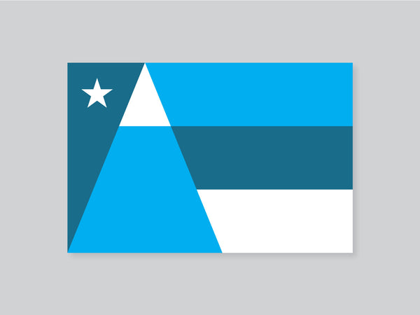
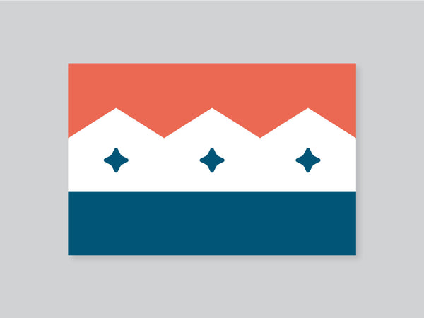
Here are a few of our own redesign attempts...